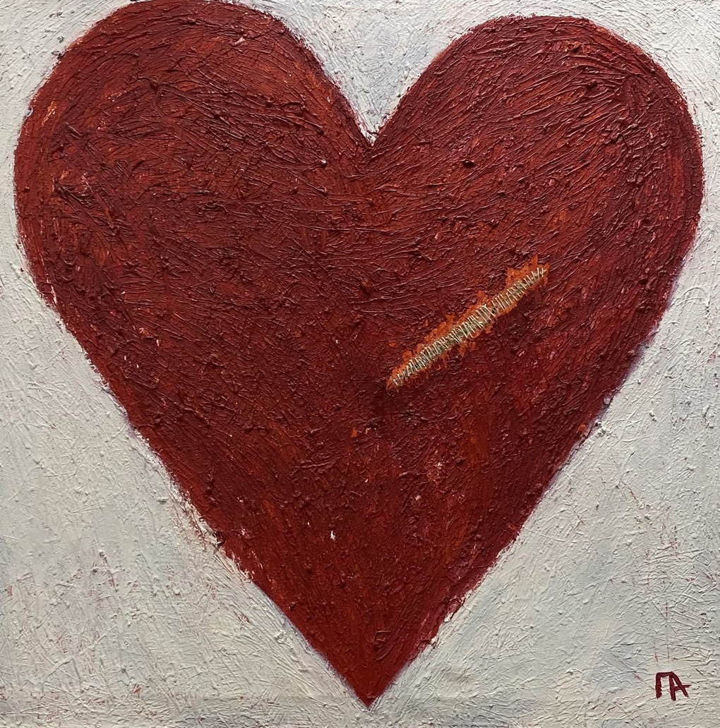
The Conflict
Alina PaylozyanThe painting The Conflict by Alina Paloyzyan is concise yet emotionally charged, with its meaning emerging from the contrast between form and detail. The central focus is a large heart in a deep, rich red hue — its colour balances between passion and unease. The texture is expressive: thick, raised brushstrokes create a sense of tension, as if the surface resists a smooth, effortless reading. The heart’s outline is clear but not perfect; its silhouette carries a raw, slightly uneven energy. The background is a calm, light grey with a grainy texture; it doesn’t distract but rather accentuates the drama of the main image. On the right side of the heart is a thin diagonal line, blending ochre, yellow‑green, and barely perceptible white strokes. This detail looks like a crack, a seam, or a healing scar — and it’s precisely this element that reveals the title The Conflict: it conveys both a fracture and an attempt at reconciliation. In the bottom right corner is the artist’s discreet monogram: a subtle accent that doesn’t disrupt the overall composition. Overall, the work is built on a paradox: the universal symbol of love here becomes a field of inner tension — and the viewer decides for themselves what is stronger in this heart: the wound or the desire to heal it.
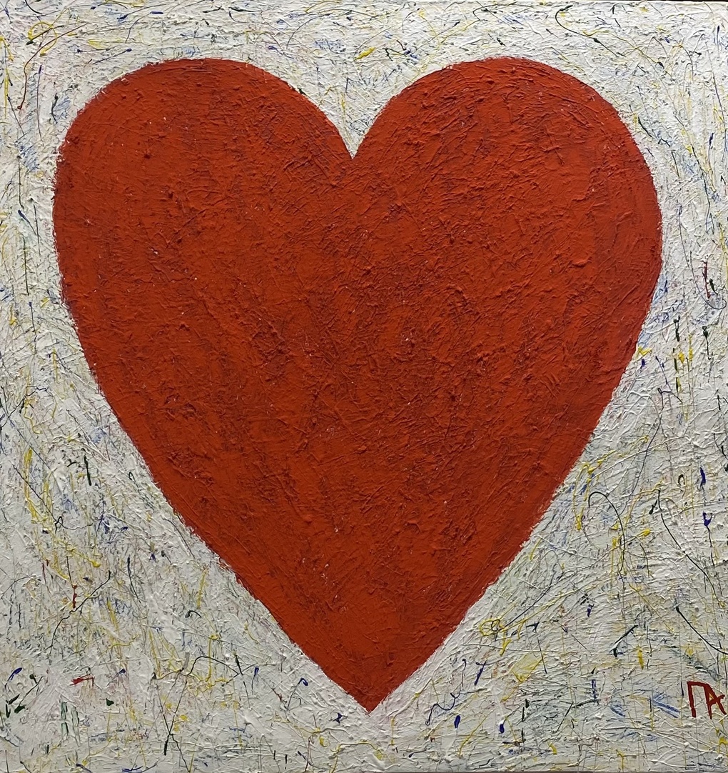
Love
Alina PaylozyanAlina Paloyzyan’s painting “Love” immediately draws the eye thanks to its striking contrast: in the center of the canvas is a large red heart that occupies almost the entire space and becomes the undeniable focal point. Its shape is simple and recognizable, yet it doesn’t look schematic—the soft, slightly uneven curves give the silhouette a sense of liveliness, as if it were drawn not with a ruler but from an inner feeling. The red color alludes to traditional notions of passion and the power of emotion, but the shade is not garish; it’s rich and deep, which lends the image weight and even a certain monumentality. Texture plays a special role in the work: the heart is painted with thick, impasto strokes—the relief of the paint makes it almost tangible, creating an effect of volume and material density. In contrast to this “solid,” weighty center, the background appears light and dynamic: across the light, almost white surface are scattered thin, chaotic strokes and small colored specks—yellow, blue, and black lines seem to capture fleeting impulses, the inner movement of space. This contrast in textures reinforces the main idea: love is a stable center around which life pulsates. Stylistically, the work balances between figurative art and abstraction: an extremely simple symbol is presented without everyday details, yet with powerful expression. In the choice of color, the freedom of the brushstroke, and the deliberate juxtaposition of textures, one can see echoes of Expressionism and Fauvism—movements where the emotional message matters more than literal precision. At the same time, the painting isn’t overloaded with references; it speaks directly and concisely. The title “Love” leaves no room for ambiguity and simultaneously makes the image universal—every viewer can imbue this simple symbol with their own personal meaning.
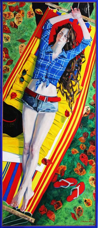
Hammock
Sergei NekrasovSergey Nekrasov’s 2016 painting is a captivating example of contemporary realism with vivid pop art influences. The artwork features a young woman lying on a vibrant towel against a backdrop of green grass and autumn leaves. She wears a long-sleeved plaid shirt and denim shorts, adding dynamism and liveliness to the scene. The sharp lines and rich colors create a contrast between her relaxed pose and the vivid background. The canvas is divided into differentiated color zones, adding visual complexity and depth to the composition. Nekrasov skillfully combines elements of realism and pop art, making the painting accessible and appealing to a broad audience.
All 3 paintings loaded